
Phones in the truck, iPads at the yard.
The worker app, the resident app and the public pages adapt from a phone to an iPad in portrait or landscape.
What it does
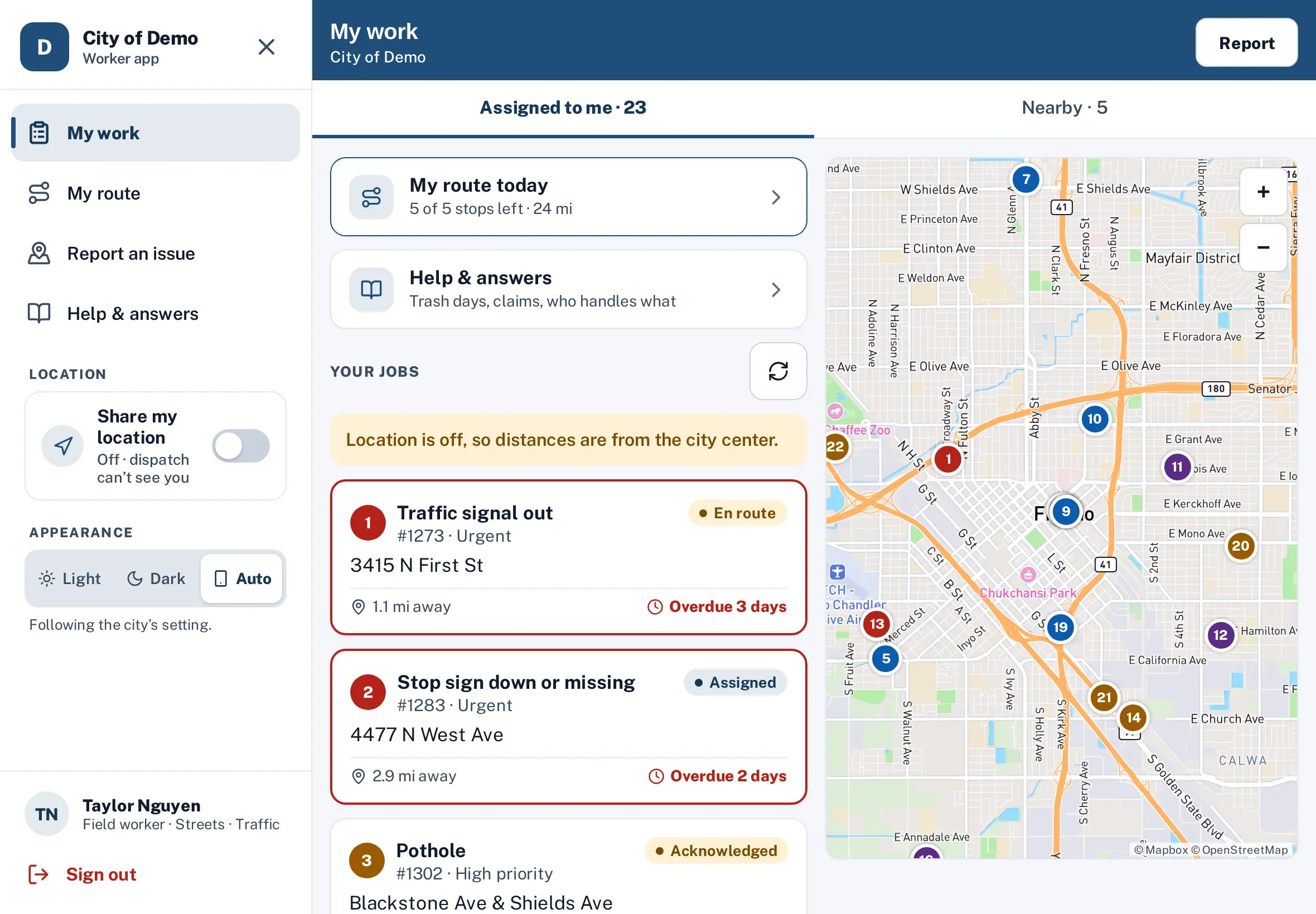
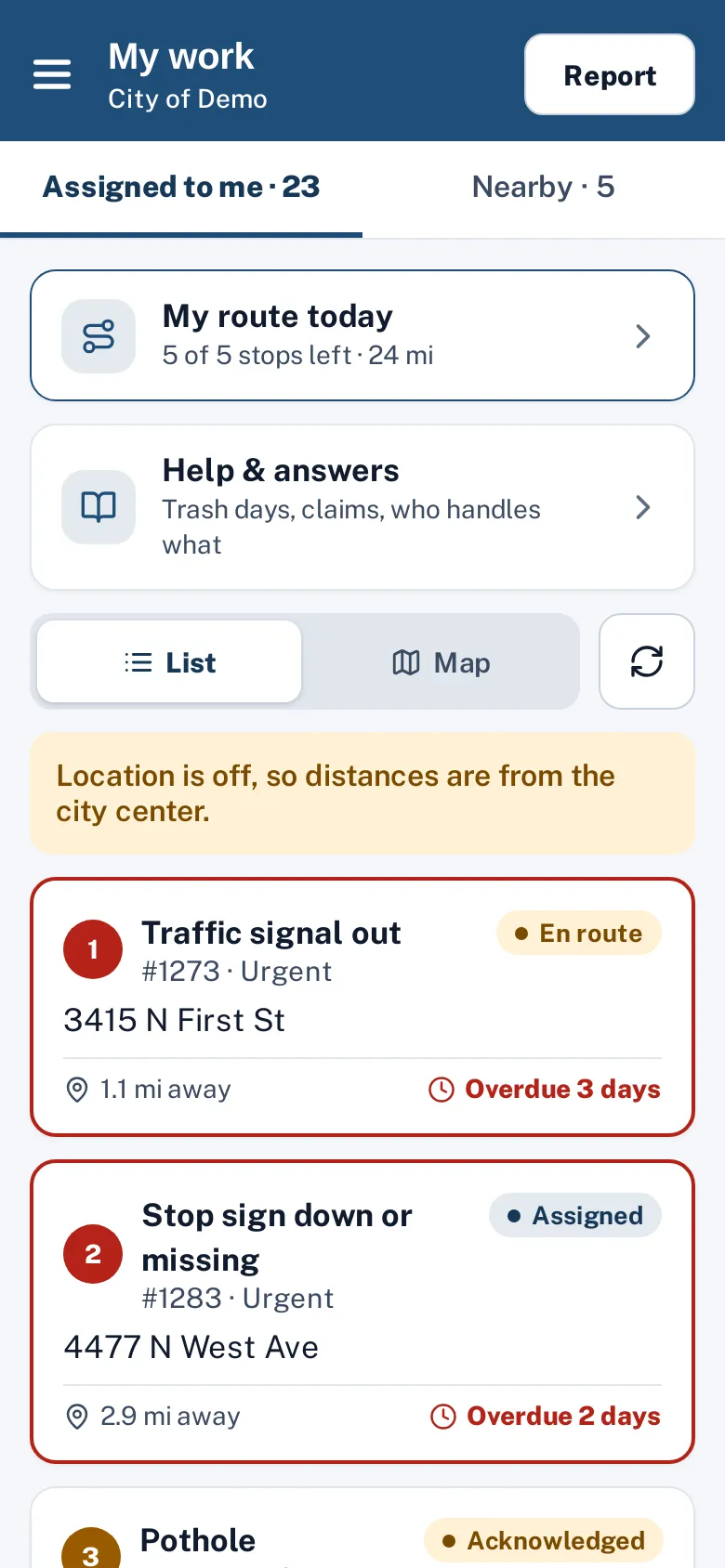
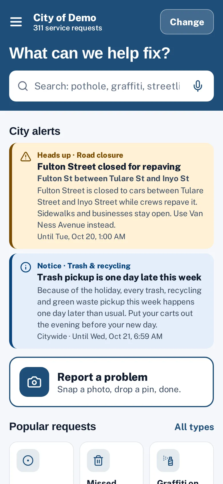
Crews use whatever device the department issues — a phone in a pocket or an iPad in the truck. The Sentra 311 worker app, resident app and public report pages all adapt: phones keep a single focused column, iPads in portrait get larger maps and wider forms, and iPads in landscape show two panes side by side.
Both apps have a side menu. On phones and iPad portrait it slides in from a menu button; in iPad landscape it stays open as a sidebar, and it can be closed when you want more room.
A phone layout stretched across an iPad wastes the screen; a desktop page on a phone is unusable.
How it works
Phone
One column, big buttons, a menu drawer.
iPad portrait
Wider forms, a bigger map, a menu drawer.
iPad landscape
List and map side by side, and a sidebar you can close.
Key features
Worker app on iPad
List beside a full-height map, ticket details beside actions, route stops beside a big map.
Resident app on iPad
Request types in a wider grid and a two-column tracking page.
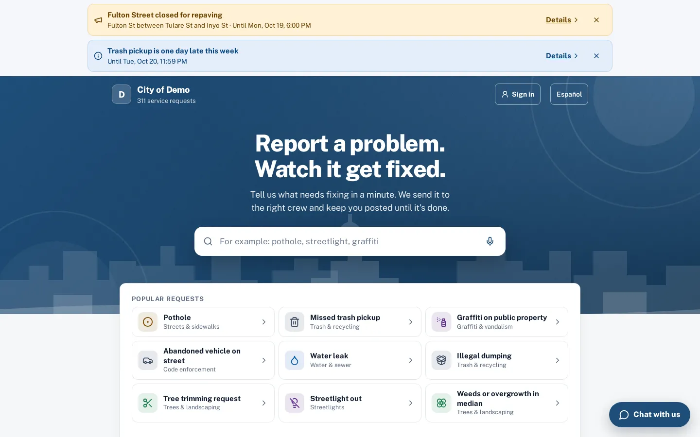
Public pages on tablets
The report map stays beside the form; tracking uses two columns; the chat opens as a side panel.
Side menu
A drawer on phones, a closable sidebar on iPad landscape.
Touch-friendly
Touch targets of at least 44 pixels and readable type.
A day with it
Under 600 pixels wide, the apps use the phone layout.
- From 600 pixels, or on any iPad, they switch to the tablet layout with larger maps and wider columns, and from 900 pixels (iPad landscape) they show two panes side by side.
- In the worker app, Home shows the job list beside a full-height map in landscape and the map above the list in portrait; the ticket shows details and answers on the left and the map, Navigate and status actions on the right; My route shows the stops beside a large map.
- Forms and help screens use a centered column.
- In the resident app, the request types grid grows to four columns in portrait and six in landscape, the report flow uses a wider column with a bigger map, and the tracking screen splits status and updates from photos and map.
In practice
- iPad in the truck. In landscape, the crew lead sees the job list beside the map.
- Phone in a pocket. On a phone, each screen focuses on one task with large buttons.
- Tablet at home. A resident reports on an iPad with a bigger map.
Public pages on tablets
On the web report page at tablet widths, the map stays beside the form on the location step, the tracking page uses two columns, and the chat opens as a side panel. On phones, the header stays on one line with a compact Home link.
Accessibility on every device
Layouts keep touch targets at least 44 pixels, use readable type sizes and keep contrast at 4.5:1 or better in light and dark appearance. Screens are checked with automated accessibility tests at phone, iPad portrait and iPad landscape sizes, and menus support keyboard and screen-reader use on the web.
Getting started
Nothing to configure. The same apps adapt to each device.
Who uses it
Crews
Use the device they have.
Residents
Report comfortably on a tablet at home.
Questions cities ask
Do you have native iPad apps?
Yes. Native iPhone and iPad apps for residents and crews are built and coming to the App Store. The browser versions work today.
Does the menu stay open on iPad?
In landscape it’s a sidebar you can close with ✕ and reopen with ☰; the choice is remembered on that device.
Can workers share an iPad?
Yes; each worker signs in and out, and the app shows that worker’s jobs.